Over seven months, a five-person team and I ran research with 18-to-30-year-olds for Nordea and reframed a "design a green product" brief into the real problem: a communication and education gap, not a missing product. We proposed a redesigned mobile experience inside Nordea's existing app, with an Impact Hub that scored the customer's and the bank's sustainability on the same scale, and a gamified Learning Hub. Nordea's product team confirmed it was buildable, and we presented it to leadership.
Context & Stakes
Nordea did a great deal on sustainability. Almost none of it reached the young customers it most wanted to win.
Nordea is the largest bank in the Nordics: 9 million customers, two centuries of history, and a substantial sustainability program behind it. But 45% of its customers didn't know what sustainability even meant in a banking context.
For a generation that increasingly picks brands on values, that gap was a strategic risk, not just a PR one. A 2022 Tink survey of UK consumers found that 43% would switch to a provider that let them see the environmental impact of their spending. The brief was direct: design a concrete "green" offering for 18-to-30-year-olds, and communicate it without tipping into greenwashing.
Role & Team
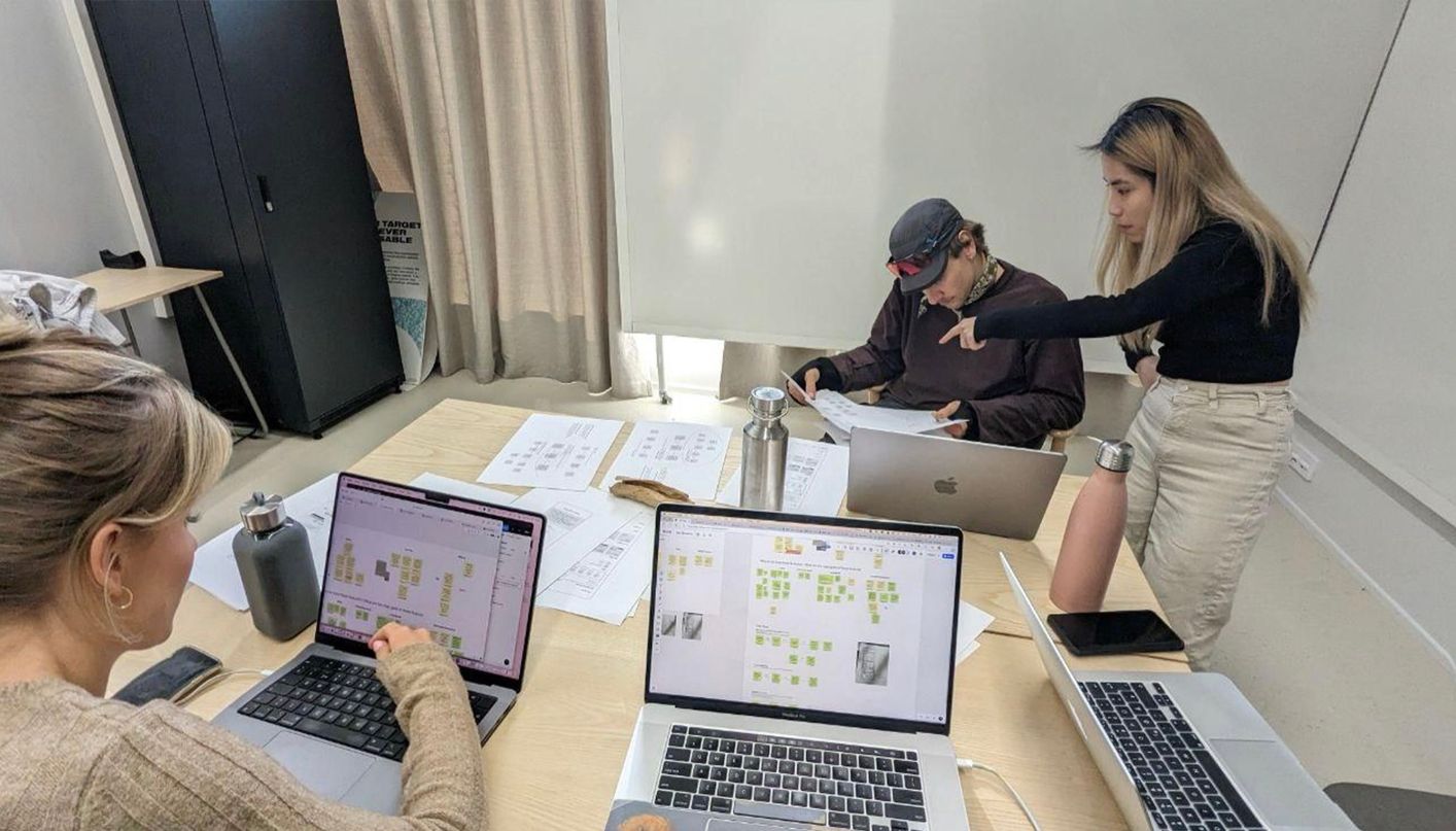
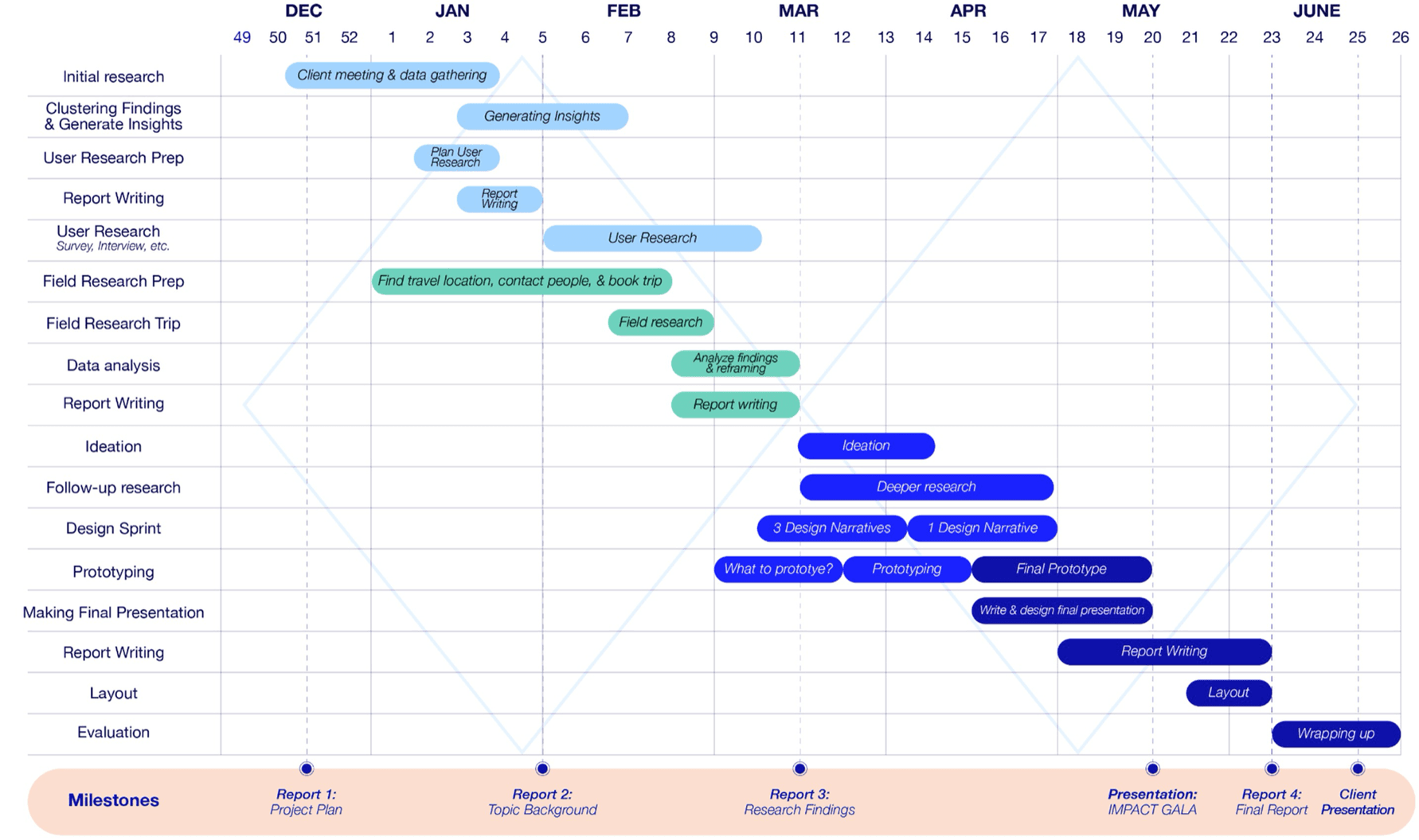
This was a university design capstone, an industry project run over roughly seven months with a five-person multidisciplinary team: two of us from business, two from design, and me from the technology side. The work was genuinely shared. We made most calls by consensus and split tasks by what each phase needed rather than by fixed titles, working through a double-diamond process and reporting to Nordea's Personal Banking team with weekly mentoring from a design lead.
Two threads were clearly mine. I led the feasibility meeting with Nordea's tech and design contact, where we walked through whether our mobile-app concepts could actually be built on the platform they already ran. And I was the main person running the wireframe prototyping sessions with users. In Figma I worked shoulder-to-shoulder with two teammates, splitting the build between us. That suited me: I was most useful moving between what users said, what the design needed, and what was technically realistic.
We worked through a double-diamond process across four phases, from discovery and field research, through synthesis, into design and prototyping.
What We Found
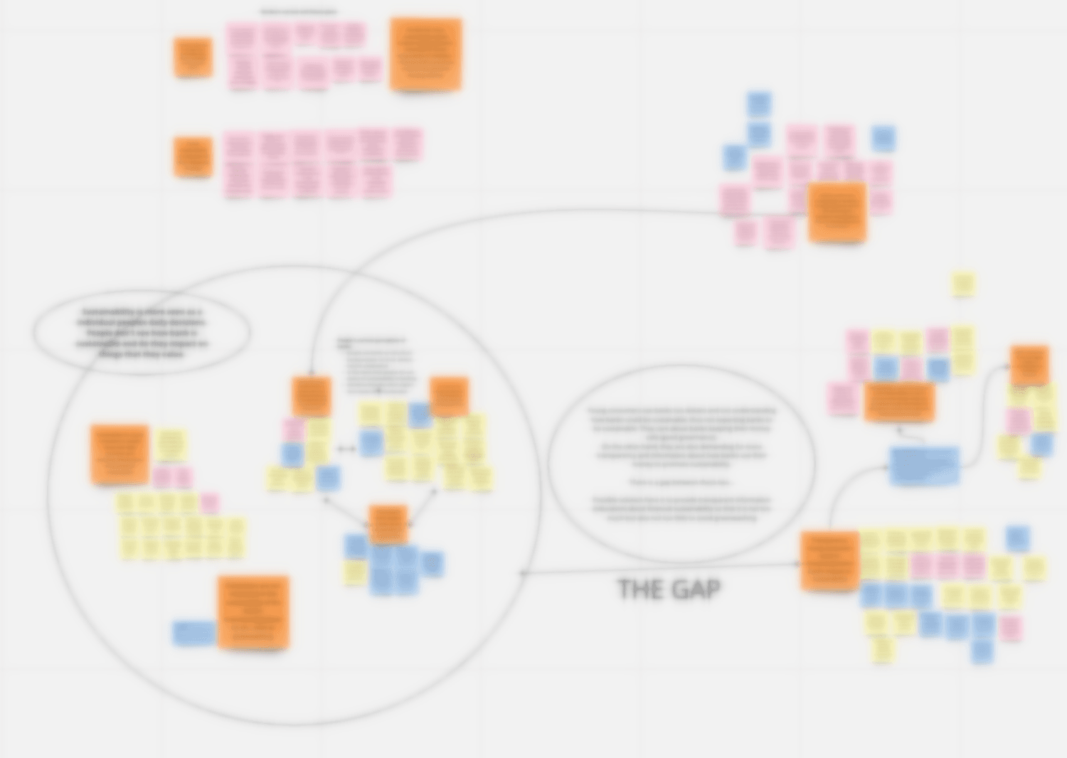
On top of desk research and benchmarking, we ran a three-part qualitative study. An online survey reached 47 young adults, which we treated qualitatively given that the sample skewed toward Aalto students. We interviewed 10 people across three life stages: upper-secondary students, university students, and graduates under 30 in working life. We ran expert interviews inside Nordea (responsible investments, responsible product and finance, diversity and inclusion) and outside it, and spent a week in Hamburg and Berlin meeting sustainable and neo-banks, among them Tomorrow, N26, and Cooler Future. Then we synthesised everything with affinity mapping.
A few findings reset our assumptions:
- Young customers saw banks as old-school, opaque, and hard to trust, and didn't connect banking to sustainability at all.
- They were least interested in the things banks love to report: carbon-neutral offices, less paper, even green home loans. They read those as the bare minimum, or as quiet greenwashing.
- What they cared about was where the bank's money goes. Both the users and the experts agreed that a bank's lending and investment choices matter far more than any individual's habits.
- They wouldn't pay extra for "sustainability" in the abstract, only for something with concrete, tangible value.
One finding already pointed to the answer: the single place all of this had to live was the mobile app. It was their main, often only, touchpoint with a bank, and several had switched banks purely for a better one.
How you actually use your money matters more than whether a single loan happens to be labelled green.
Problem Definition
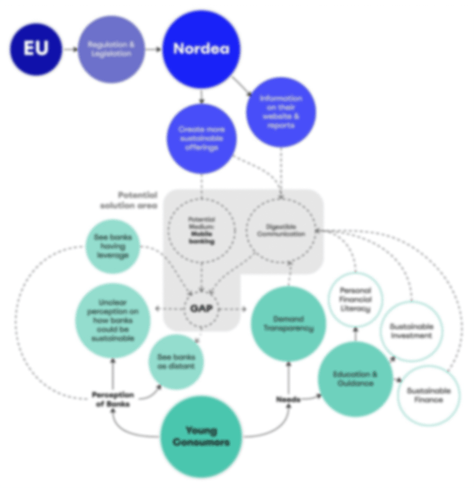
Design a green product, said the brief. The research pointed somewhere else: not at a missing product, but at a bank whose work no one could see.
Nordea wasn't failing on sustainability. It was failing to make its sustainability visible and meaningful to young customers. The real problem was a communication and education gap: a bank doing a great deal, customers who couldn't see it, and a subject that stayed abstract right up until it touched their own money.
We drew it as a systems map, with the youth's perception of banks on one side, their unmet need for transparency and education on the other, and tightening regulation pushing the whole field from above. The opportunity sat in the middle, and it wasn't a new product or a campaign. It was making sustainability tangible and actionable inside the one place young customers actually showed up. We also accepted there was no single answer for everyone, since needs shift sharply across the 18-to-30 years.
Key Decisions
Build inside the existing app, not a new product
Discarded: A standalone sustainable product or a fresh communications push, which was the most literal reading of the brief.
Chosen: New features inside Nordea's existing mobile app, the youth's primary touchpoint. I took our concepts into a feasibility session with Nordea's tech and design side, and we confirmed they could be built without a new app.
Tradeoff: Less of a flashy "new offering" to point at in a pitch, but far more likely to reach real users and to survive contact with the platform Nordea already runs.
Give the bank the same yardstick as the user
Discarded: Presenting Nordea's sustainability work as the bank's own good-news story, the way an annual report does.
Chosen: A comparable impact score for the bank, on the same scale as the user's. We made this call after prototype users dismissed Nordea's self-reported impact as PR and flagged it as greenwashing.
Tradeoff: It puts the bank on the same measured footing as a 23-year-old's grocery spend, which is humbling for a 200-year-old institution. It was also the only version users actually trusted.
Prototype as a probe, and kill what failed
Discarded: Polishing a single hero concept to reveal at the end.
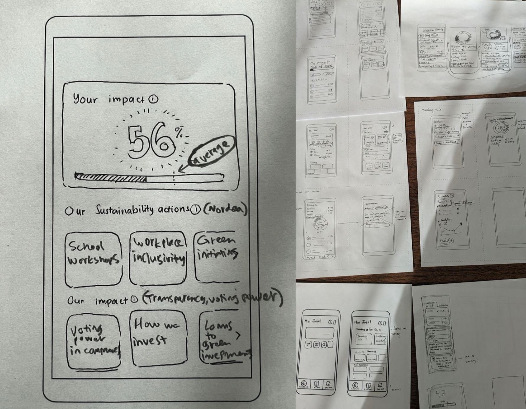
Chosen: Low-fidelity wireframes and paper prototypes tested with nine users, routed by a short onboarding survey into a consumption, investing, or learning flow.
Tradeoff: Rougher artefacts, but we learned fast, and we got to drop a feature that didn't work. A peer-to-peer advice forum sounded right on paper, since young people trust friends over bank advisors, but it fell apart in testing: users distrusted answers from strangers, and it would have needed heavy moderation to be safe.
Solution & Deliverables
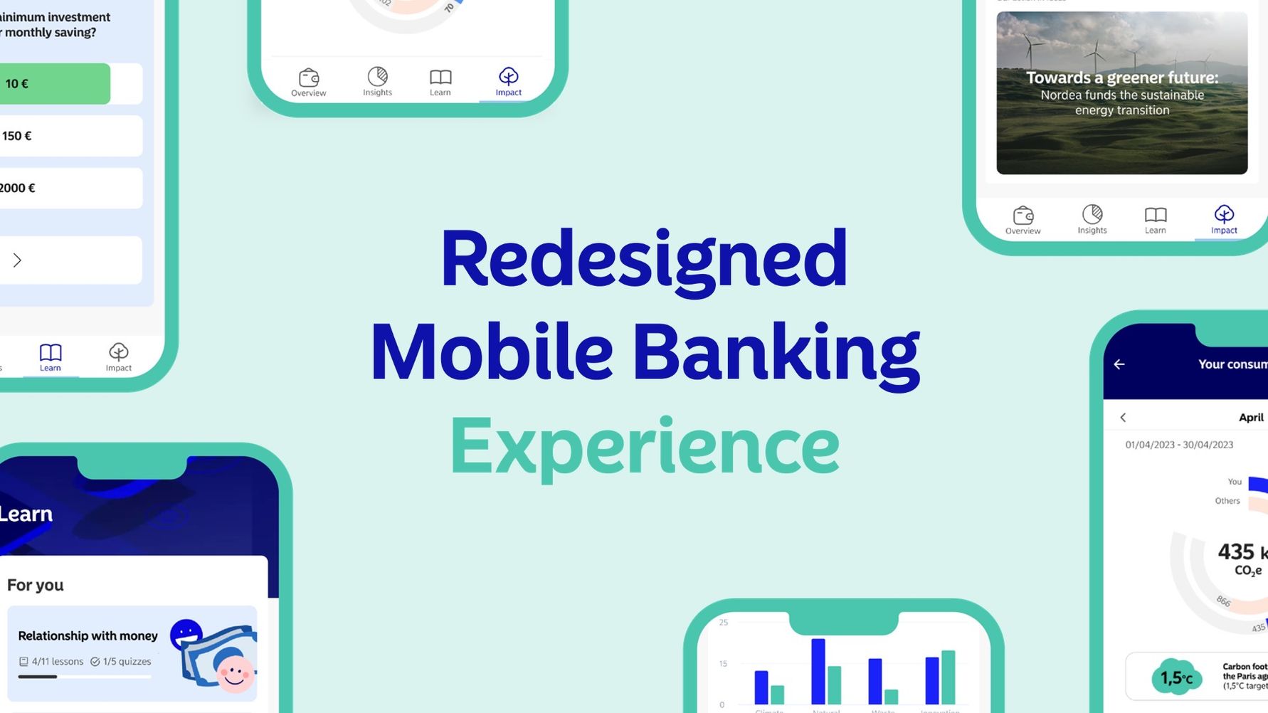
We proposed a redesigned mobile banking experience for 18-to-30-year-olds, built into Nordea's existing app, with two features.
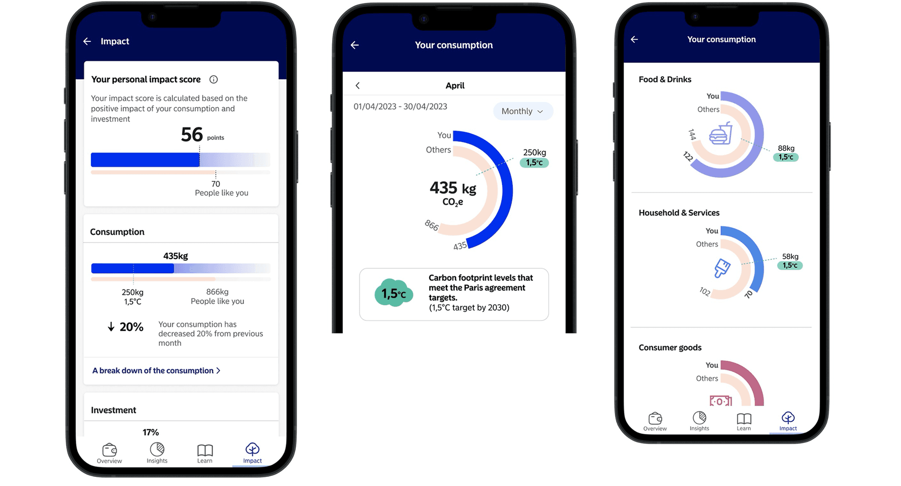
The Impact Hub turned sustainability into something a person could see. It gave each user a personal impact score across their consumption and investments, broken down by category and benchmarked two ways: against the Paris Agreement's 1.5°C goal, and against "people like you." It also gave Nordea its own impact score on the same scale, with bite-sized summaries of what the bank was actually doing. Transparency became a shared number rather than a brochure.
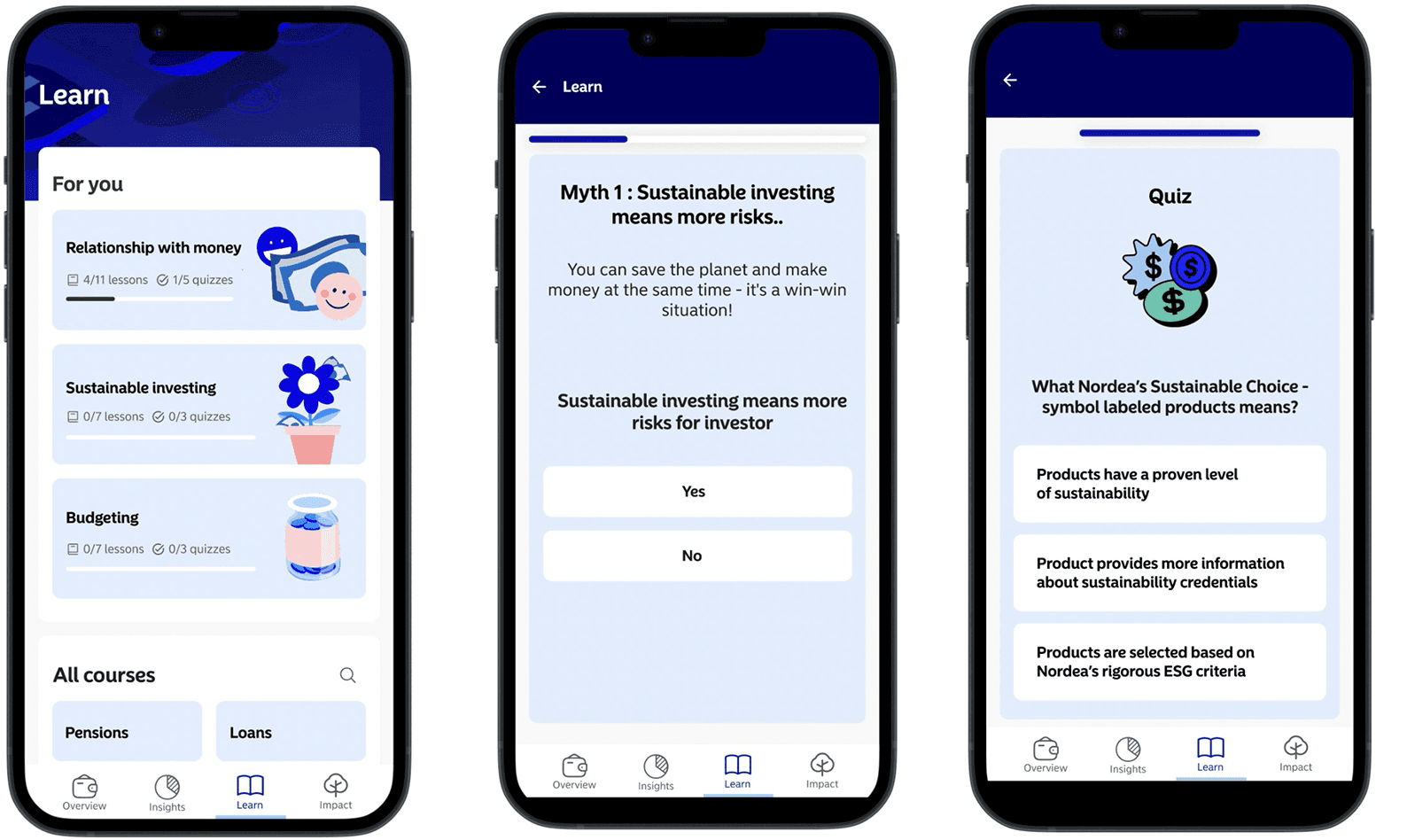
The Learning Hub made financial and sustainability education feel like the apps young people already use: gamified, bite-sized, personalised, with progress to track. We framed it as a natural extension of Nordea's existing school workshops, carried into the app.
Outcomes
A concept the product team called buildable
In the feasibility session, Nordea's customer-experience and product-strategy people confirmed the features could be implemented for the 18-to-30 segment inside the existing app, with no need for a separate product.
It landed with leadership
We presented the final concept in a one-hour session to Nordea's leadership. It was nerve-wracking, and it drew a lot of strong, engaged feedback rather than polite nods.
Honest Reflection
What surprised me was how confidently we could be wrong about an "obvious" feature. The peer-advice forum followed straight from our own research, that young people trust friends over bank advisors, and users still rejected it the moment they saw it. It taught me to treat even well-evidenced ideas as hypotheses until someone actually tries them.
What I'd do differently is recruitment. Our sample leaned heavily on Aalto students and the Helsinki area, and the young people who go straight from vocational school into working life, probably the least engaged with this topic and the most interesting to convince, were exactly the ones we struggled to reach. I'd design the recruiting around that gap from the start, not discover it at the end.
The thing I'm still sure of is the core move. Transparency for this audience was never about more information. It was about giving the bank and the customer the same number to look at.