Over four weeks, working solo, I used Claude Code to build a unified, token-based design system for Risto Reipas, whose web and mobile apps had grown for years with no shared design foundation: hundreds of hardcoded values, mismatched fonts, and dozens of one-off shadows and spacings. I also worked through a round of UX fixes that an earlier audit had flagged on both apps. The result is one consistent, accessible foundation that both codebases draw from, handed to an in-house owner to carry forward.
Context & Stakes
Two apps, built fast over several years, with no shared design system underneath them.
Risto Reipas is a small Finnish startup running a two-sided car-transport marketplace, sometimes described internally as "Wolt for car transport." The web app is for the demand side: the companies booking transport, and the dispatchers who coordinate it from a desk. The mobile app is for the supply side: the self-employed drivers out doing the jobs.
It had grown fast, shipping features first, with both apps built by an outsourced engineering team and no designer involved, so there was no design system holding them together. Colours, type, spacing, shadows and corner radii were hardcoded throughout both codebases, in the hundreds, and the web app still ran on a legacy UI stack of Bootstrap and an old Argon theme. Over the years the two products had drifted into looking and behaving like distant relatives rather than one brand.
A technical and design audit done just before this project had catalogued that inconsistency, along with a set of UX and accessibility issues. Accessibility was the most pressing: the EU Accessibility Act deadline had passed, and the forms carried no accessibility support at all, so the gap was a legal one and not only a matter of polish. Netlight brought me in to build the foundation that had never existed, and to do it quickly.
Role & Approach
The work was solo and full-stack, from the design decisions down to the code that carries them, across both the web and mobile codebases. Moving between design and implementation, rather than handing work off between them, is where I'm most useful.
I leaned heavily on Claude Code to get a job this broad done in four weeks. The one rule I kept was not to trust its output on faith: nothing it produced was final until I had checked it against the real code and the audit.
What I Found
Going through both codebases confirmed what the audit had found. Dozens of slightly different shadows. Several typefaces and weights, used inconsistently. Spacing and corner radii picked case by case. Colours hardcoded in the hundreds. On the web side, the legacy theme layered its own defaults on top of all of it.
None of this was careless work. It was the result of there never having been a design layer to build on. With no shared system to draw from, each screen had defined its own values, and across years and two codebases that became two apps that no longer agreed with each other.
Problem Definition
The quick win was to make the apps look consistent. The fix that would last was to give them a shared foundation, so they'd stay that way on their own.
Restyling each app by hand would have helped for a while and then drifted back, because nothing underneath would have changed. What was missing was a single source of truth: one set of design tokens, for colour, type, spacing, shadow and radius, that both apps draw from directly. With that in place, staying consistent stops being something to police screen by screen and becomes the default. Building that foundation, rather than repainting the surface, was the real job.
Solution & Deliverables
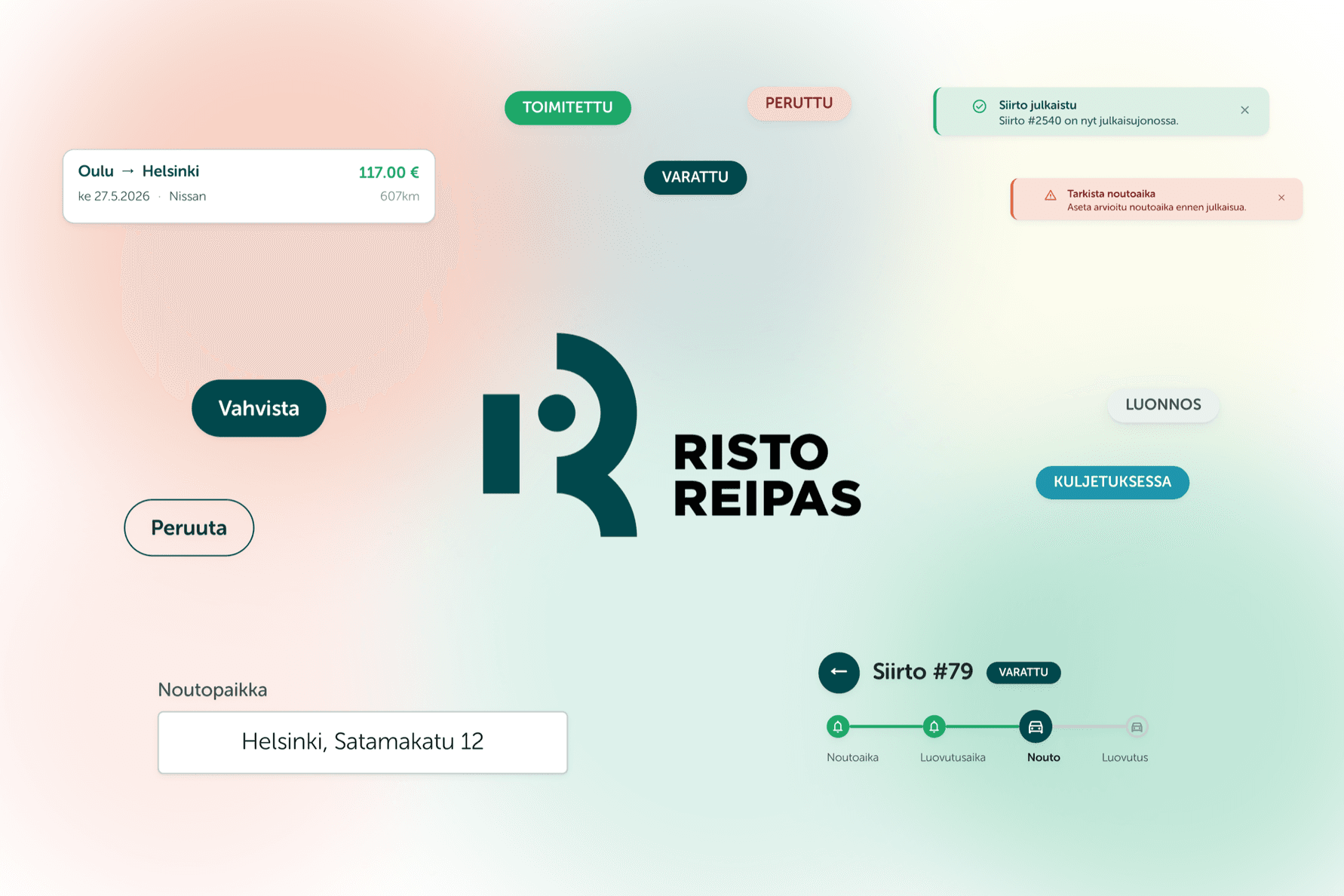
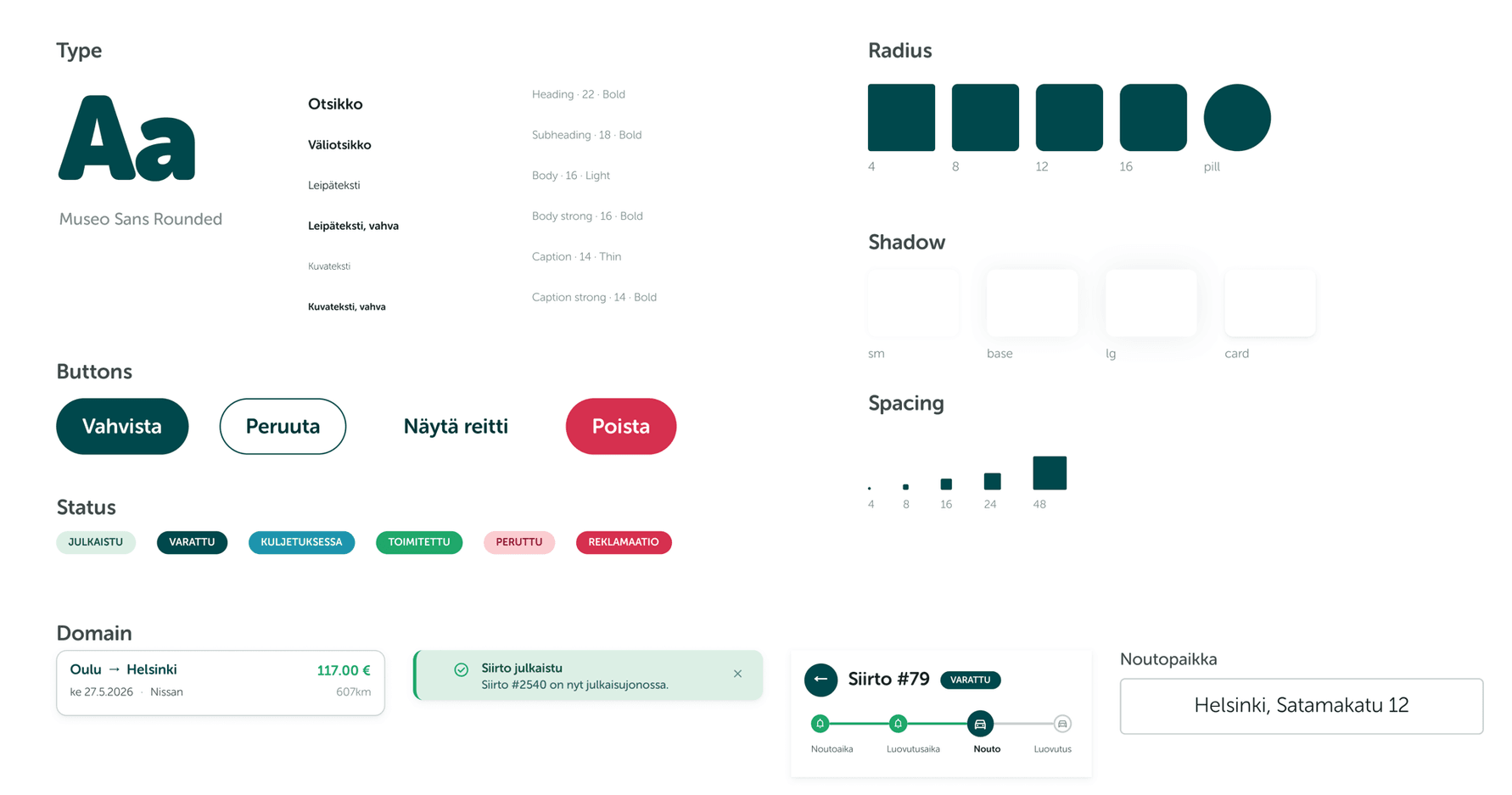
I built the system as a set of design tokens that both codebases use, so each value is defined once and applied everywhere. A Figma library is generated from those same tokens, which keeps the design source and the code in step, and a set of lint rules flags any hardcoded value and points to the token that should replace it, so the system can't quietly drift apart again.
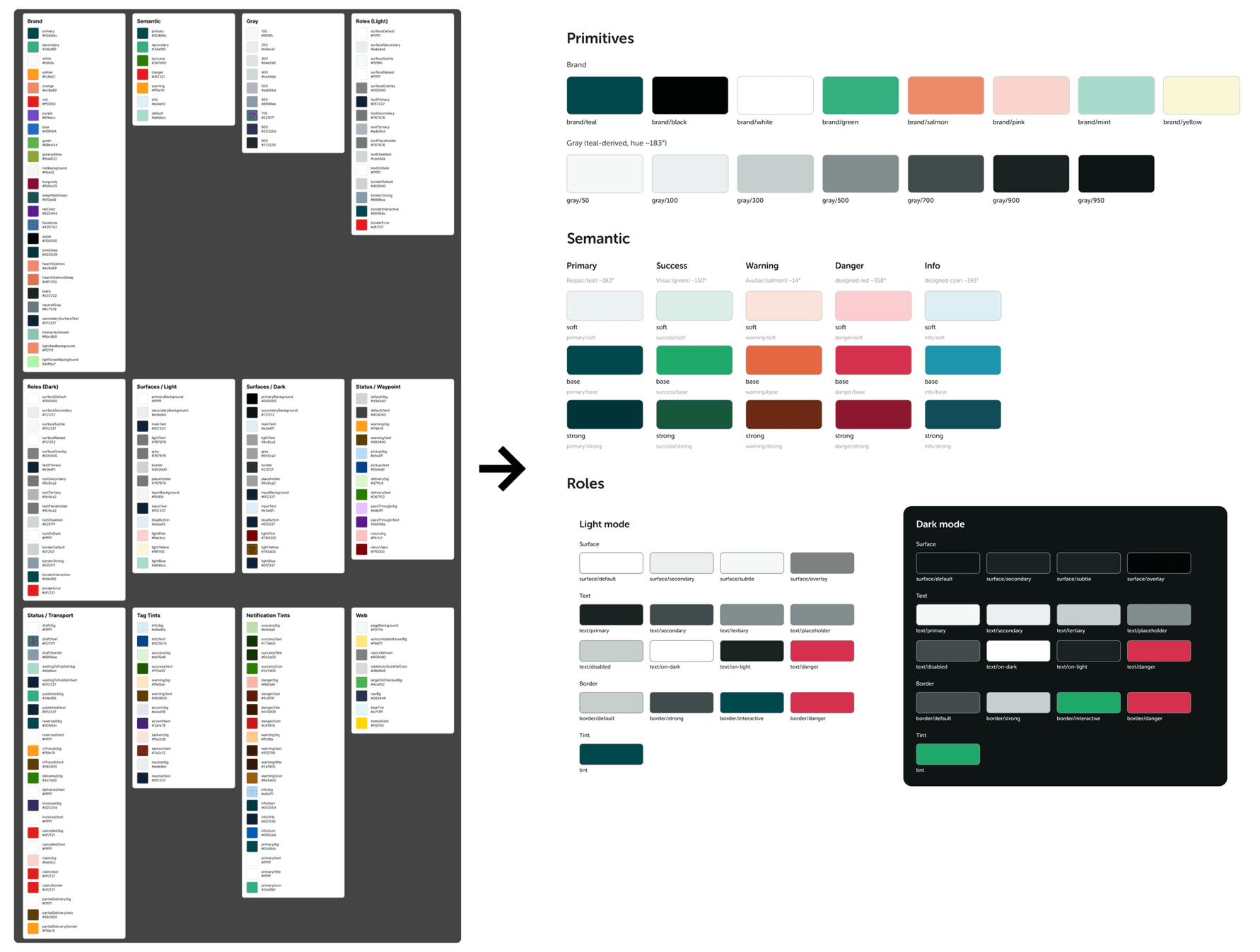
The brand colours stayed as they were; what I changed was the structure beneath them. I reduced a sprawl of overlapping colours and text styles to a small, deliberate set, separated the brand colours from the functional ones the interface uses day to day, and put both apps on a single shared type scale.
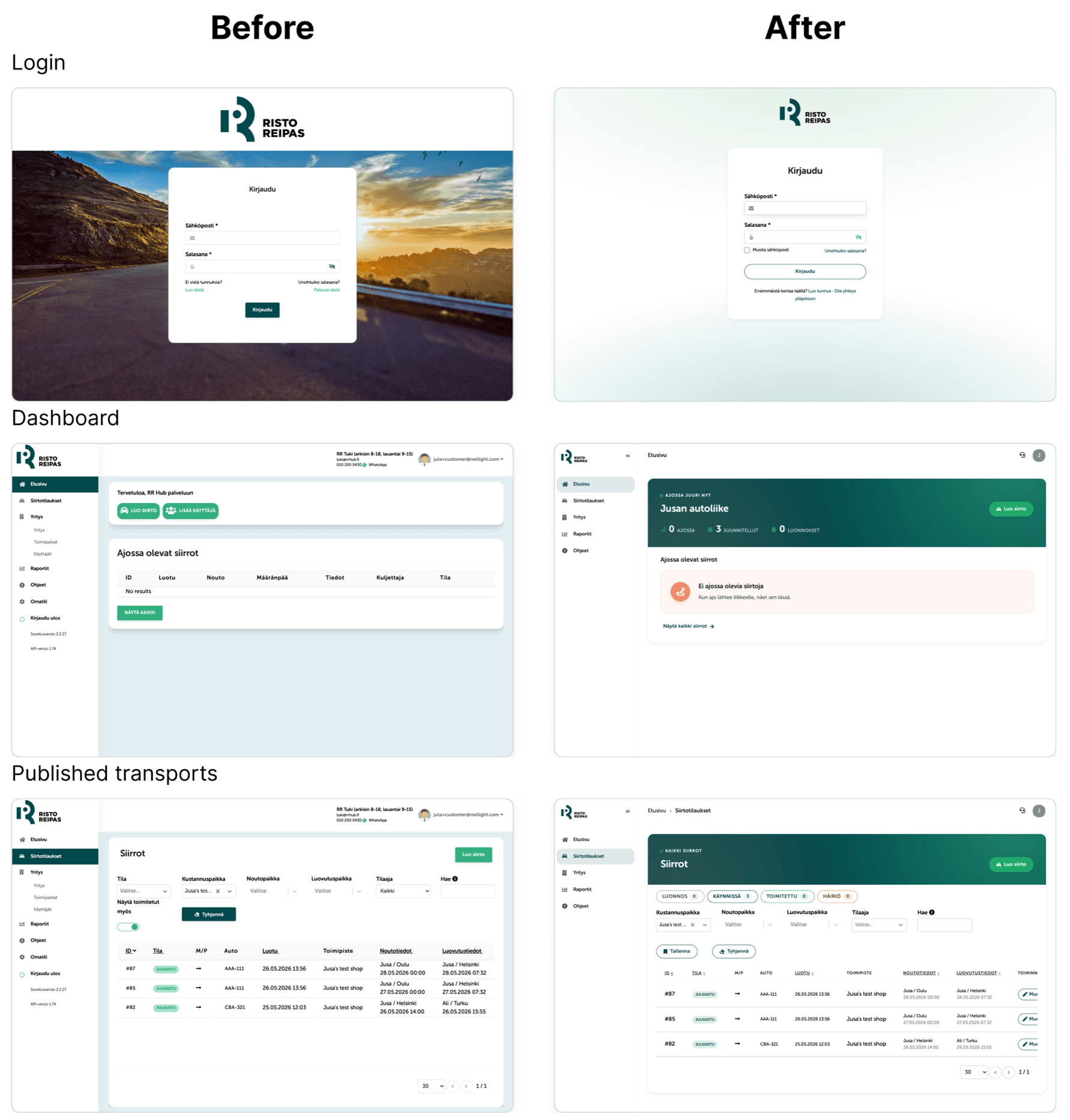
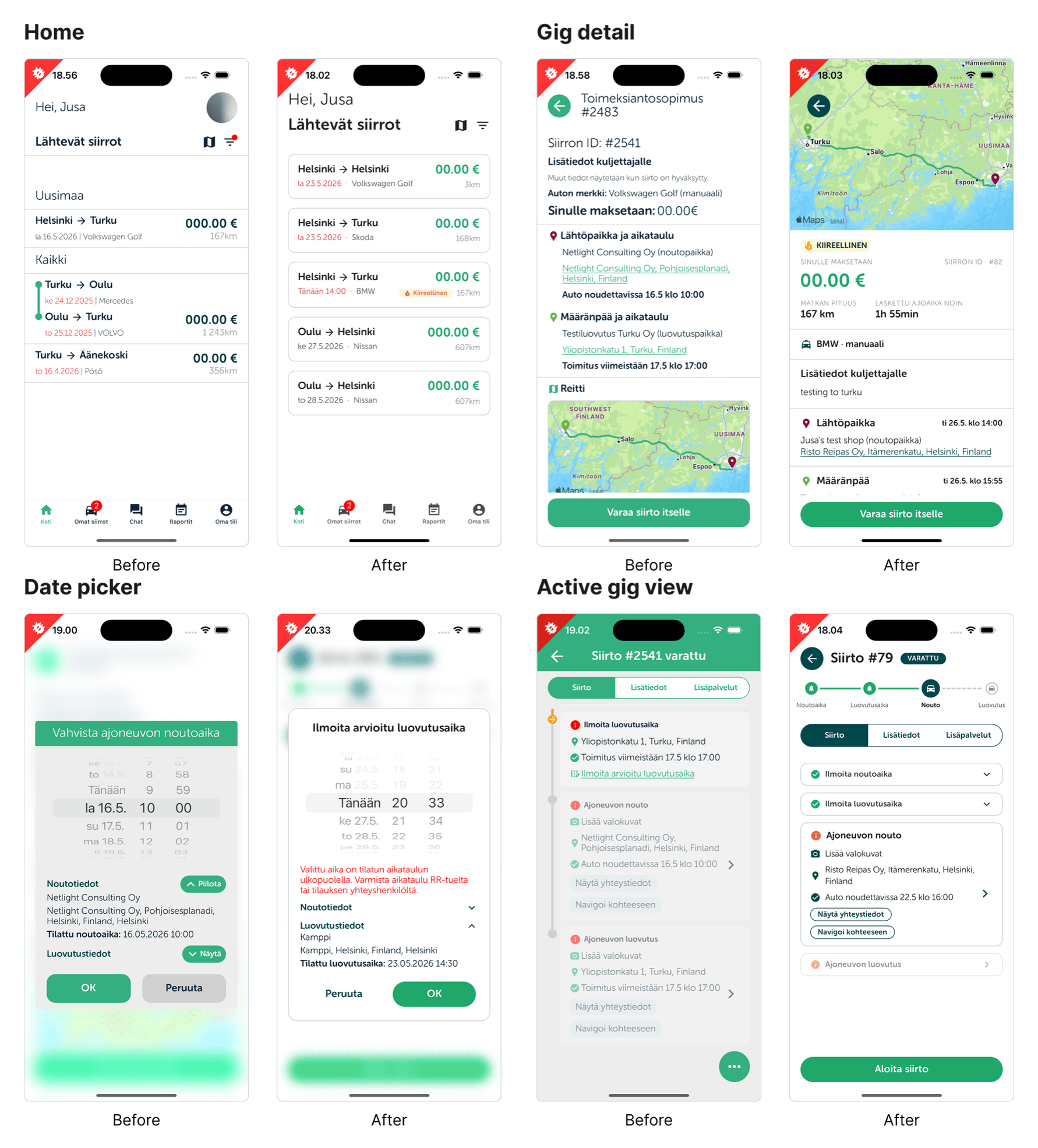
Since I was already inside both codebases, I worked through the UX fixes the audit had raised. The biggest was on web: the form for setting up a new transport job, which had been spread across several screens, collapsed into a single view that's much quicker to complete. I reworked the web login screen, redid the type hierarchy and most of the main screens on mobile so they're clearer and easier to read, and fixed a scatter of smaller things, including modal dialogs whose confirm and cancel buttons had been the wrong way round. The legacy web app came onto the new tokens at the same time, so it could share the foundation without a full rebuild.
Outcomes
From a sprawl to one system
The colour palette came down from roughly 160 tokens to 70, and the text styles from 18 to six, now defined once and shared by both apps instead of redrawn in each.
Accessibility built into the foundation
The colours were redone to meet WCAG 2.1 AA, and every pairing is checked against it, so the standard the apps had been missing is built into the foundation rather than retrofitted later.
Handed over to carry forward
I built it to be handed over, and kept the in-house owner who'll run it involved throughout, so picking it up is a continuation rather than a fresh start. The web app goes out to a small group of users for testing next, with a wider rollout to follow.
Honest Reflection
I'll be honest that the project kept changing shape. The scope grew and shrank as I learned what the two codebases actually needed, and the plan I finished with wasn't the one I started with. For a few weeks of work sitting on top of years of accumulated inconsistency, that was probably unavoidable.
For all the speed the AI added, the design judgment was the part that mattered: deciding what the small, deliberate set of values should be, and recognising that a real foundation, built once and shared, was what these apps had been missing all along.